When comedian Jerry Seinfeld launched his book “Is This Anything?”, he took the notes accumulated throughout his career and laid them out on a New York street, filling it with papers. This, says Răzvan Ipate, data analyst at Levi9, is the perfect metaphor for the effort of finding an insight in a pile of data.
Data analysts often have to think as a storyteller when exploring datasets and creating visualizations. Is this insight meaningful? Is this the right way to present it? How can I make the story pop?
With over four years of experience of digging through data and crafting compelling dashboards, Răzvan has developed a process for separating valuable information from noise and for bringing data to life through engaging stories.
Start with these three key questions
Like every storyteller, Răzvan must first ask himself who he is writing for. “Knowing your audience is crucial”. Each project starts with discovery as he familiarizes himself with the client, the client’s industry, language, data infrastructure, specific measurements and reporting needs.
When getting to know the customer, Răzvan is aware that “different stakeholders have different needs and priorities.” He says he does not assume that he knows exactly what each person is looking for in a report, so he uses a set of questions to get to the very bottom of what the user needs.

The answers to these questions provide Răzvan with a mission. They also allow clients to better articulate what they want or what issue they want to solve by analyzing data.
Explore until you find something
After getting familiar with the data, Răzvan starts some free-form explorations. Just like a comedian jotting down notes, Răzvan gets to interrogate immense datasets, slicing and dicing information to uncover hidden insights. Sometimes an interesting insight pops up and he reverts to Seinfeld’s guiding question: “Is this anything?”
Cut everything but the essential
That key insight might lie at the heart of the story that the data will narrate. “Instead of exposing every available metric, I construct focused data models containing only relevant dimensions and facts,” Răzvan says. Thinking back to Seindfeld’s paper-filled street, cutting the irrelevant data is essential. Not all jokes make it on stage. Only a fraction of the data makes it into the dashboard.
Use feedback to improve
Before doing a grand show, comedians often test their jokes with smaller audiences. This is because, instead of taking feedback personally, they use it to hone their craft. The same is true for data storytelling.
“A key part of the process is gathering feedback,” says Răzvan. Just as comedians workshop jokes, he relies on stakeholders to provide critiques of preliminary dashboards. “Feedback like ‘I like it’ or ‘I don’t like it’ isn’t very helpful on its own. I want to hear specific, constructive comments. Things like ‘It’s hard to find what I need quickly’ or ‘I’m not sure how to navigate this’ give me clear direction on how to improve.”
Focus on clarity
When determining how to visually represent data, Răzvan opts for simplicity over flashiness. “The criteria I use for assessing a dashboard are readability, simplicity, and intuitiveness,” he states. While animated, multi-colored infographics may seem more engaging, they often obscure meaning.
Just as Seinfeld organizes his jokes to lead to the punchline, Răzvan arranges dashboard components to emphasize important information. Reducing clutter and establishing visual hierarchies transforms messy data into coherent narratives. Here’s an example.
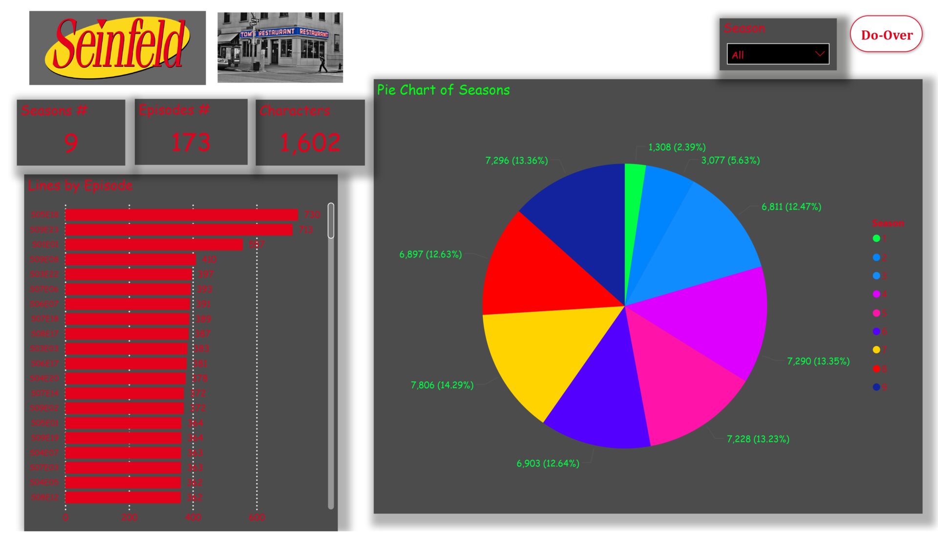
Before
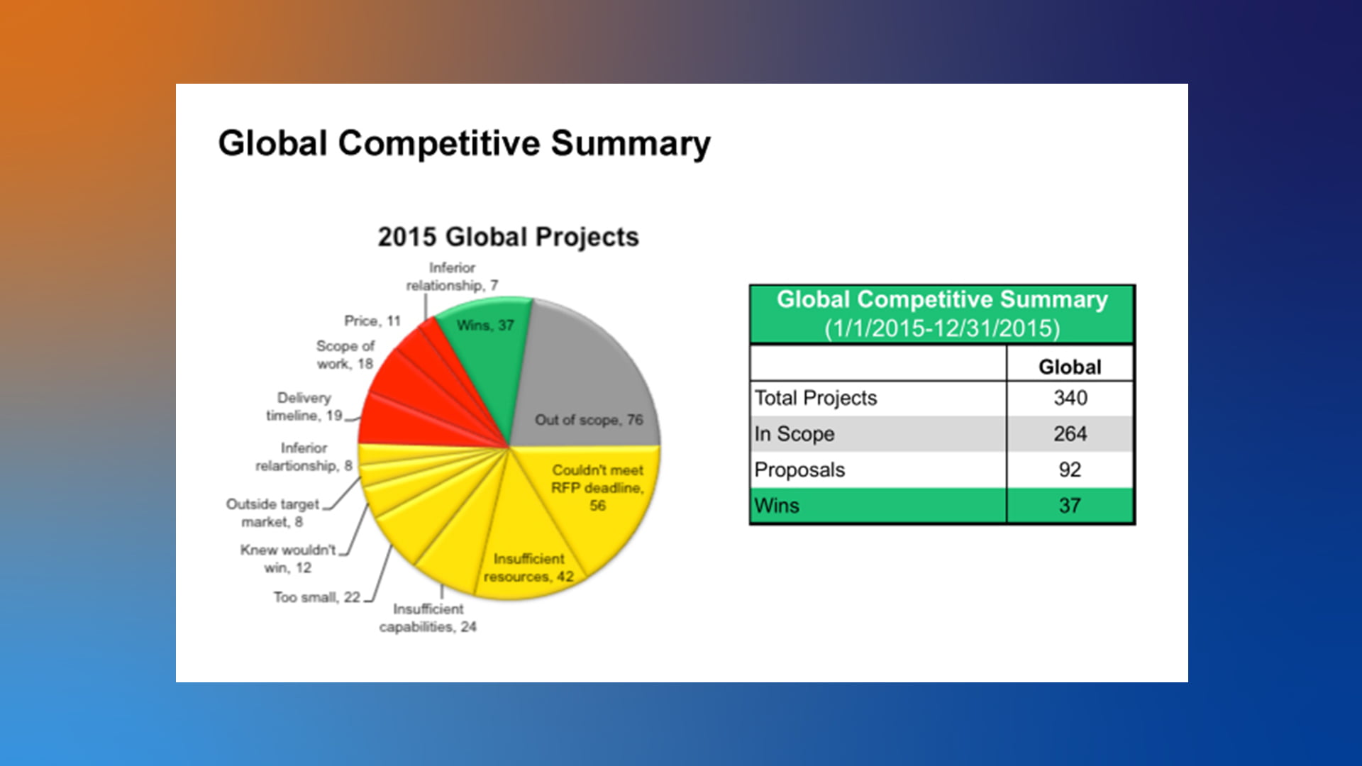
“I honestly don’t know where to focus,” Răzvan admits about this graphic. “The title tells me nothing, there are too many colors and not enough context.”
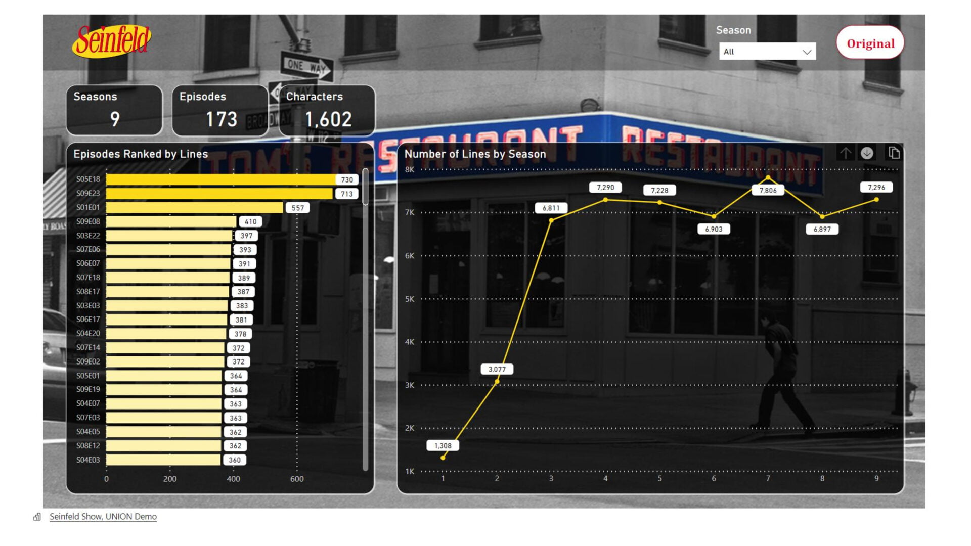
After
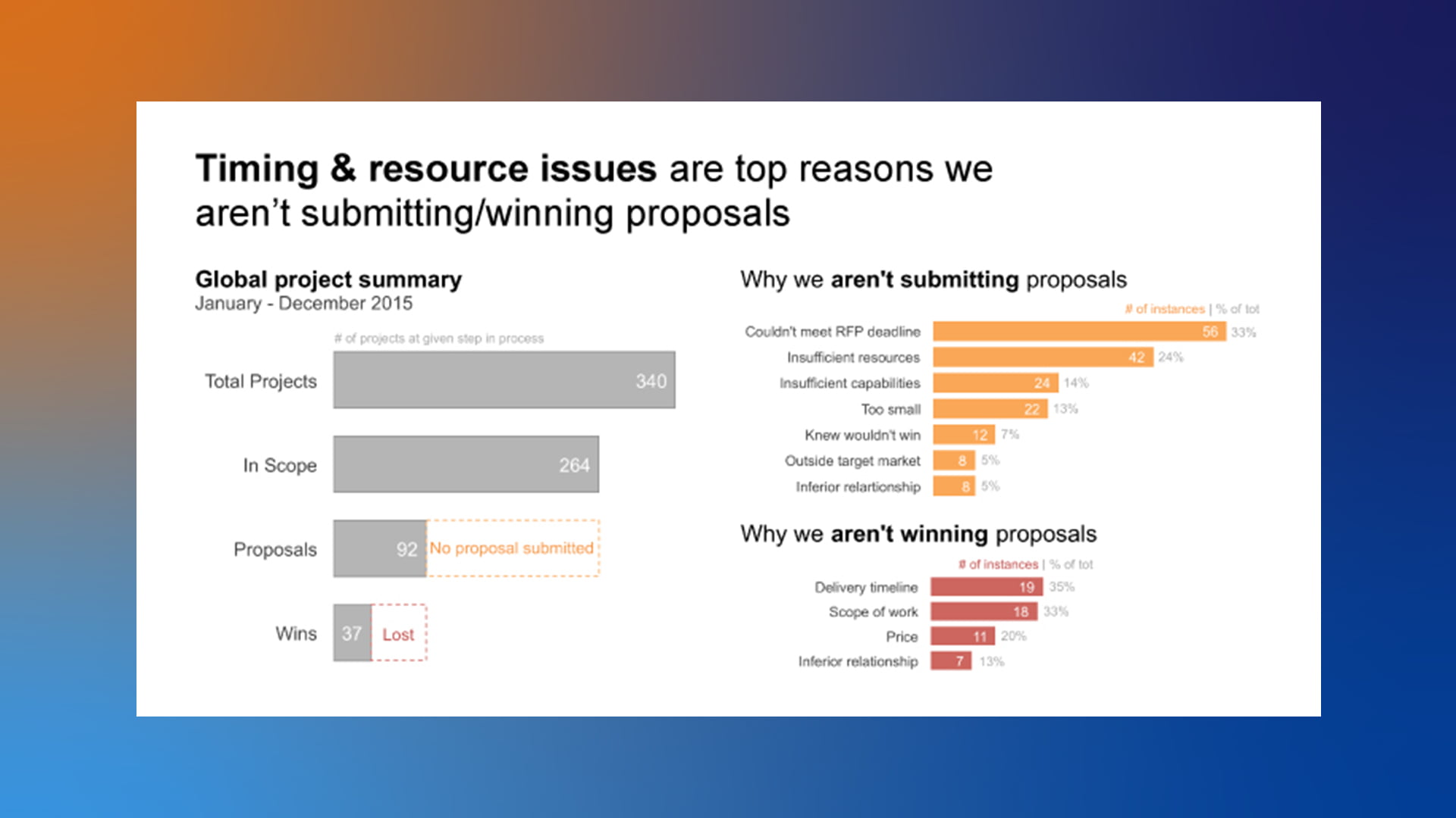
The post-makeover visualization opts for a simpler, bolder design that immediately directs eyes to the header: “Timing and resource issues are the top reasons we aren’t winning more proposals.”
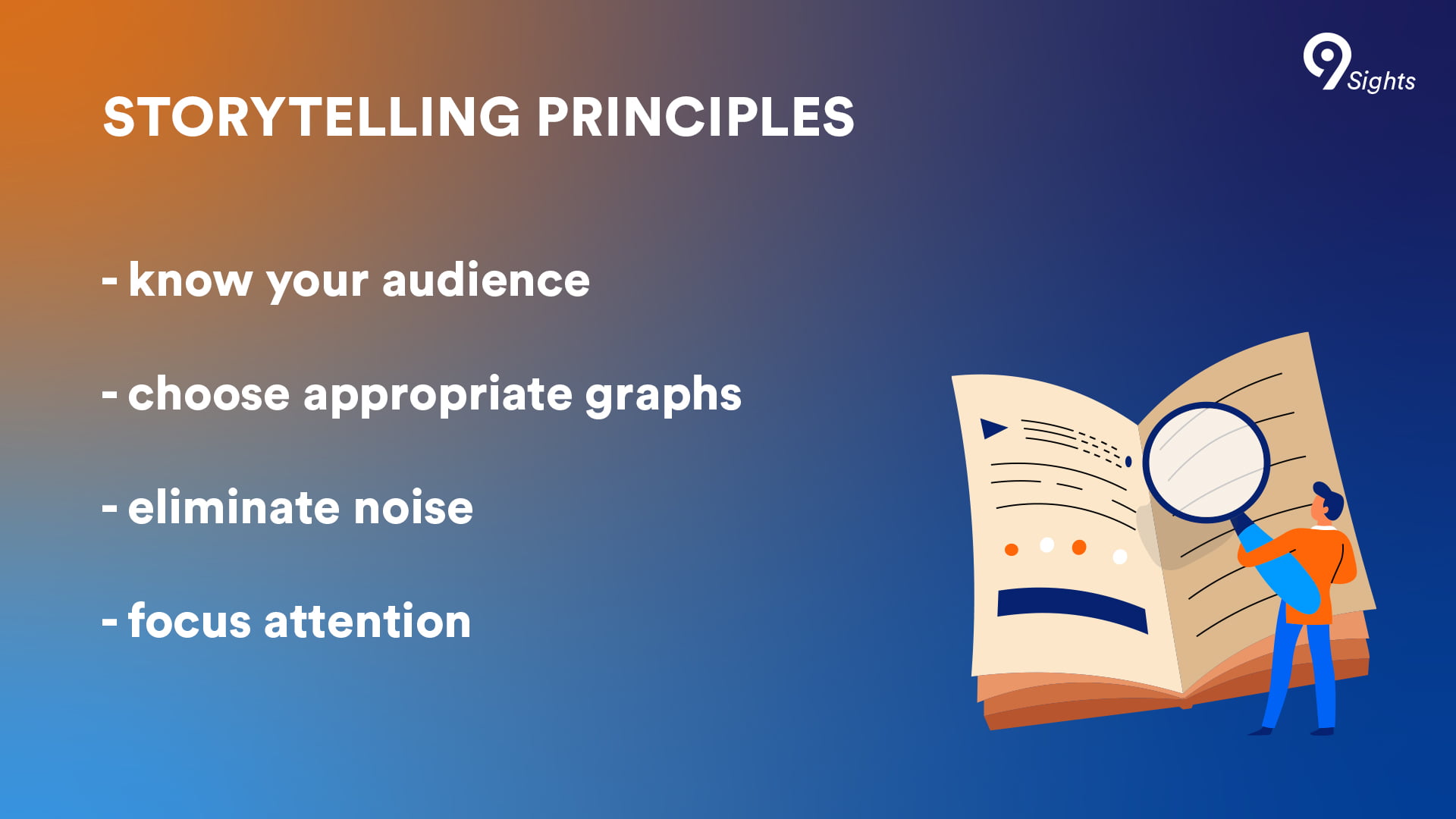
The new visualization applies Răzvan’s guiding principles of visual storytelling: choosing the graphs according to the audience, eliminating the irrelevant, and focusing attention on the essential.
“Absolutely nothing in this dashboard is placed randomly,” he says of an exemplary report. “All the font colors and sizes, the shadows, the overall composition – every element has a purpose.”
Plan according to real estate
An episode of Seinfeld was, on average, 22 minutes long. Likewise, what a data storyteller can tell at a first glance is limited. “The real estate on a dashboard is not infinite,” Răzvan points out. “We need to be mindful of the space we have and use it wisely to convey our message effectively.” Depending on where the data is displayed, the story needs to change and sometimes be presented in episodes.
Rather than cramming every chart onto a single page, Răzvan strings together complimentary charts to construct a narrative flow. “I’ll use one chart to state the essence of the analysis, then use subsequent charts to provide details,” he explains.
The guiding principles of data stories
Răzvan employs basic elements like fonts, colors, and tooltips to draw attention to key insights and guide interpretation. Color plays a crucial role in effective data storytelling, according to Răzvan. “The human eye does two things very well: it easily distinguishes what is different in a landscape, and it quickly associates things with each other,” he says. “In data visualization, we can leverage this by using colors purposefully and consistently.”
No explanations necessary
With new tools for data visualization and a myriad of sources for inspiration, choosing the slickest graphic may be tempting. But Răzvan cautions against this urge: flashy graphics risk being written off as gimmicks despite eye-catching allure if underlying meaning remains unclear. “If I need to hold a company-wide training to explain how to read a chart, then I am not doing my job,” Răzvan said. A Seinfeld joke should need no explanation. A cool dashboard that needs to be narrated is not useful.
Does your story have a punchline?
Your first dashboard won’t be your last. After feedback from clients and your own assessment, you should try and improve it.
When he evaluates his own work, Răzvan focuses on one primary objective: “I want people to intuitively grasp the point within a few seconds of looking at a dashboard. The data story should be clear even without a lot of text explaining it.”
Răzvan even gauges his growth by assessing past work. “If you look at a dashboard you made a year ago and you wouldn’t do anything different today, something’s not right,” he asserts. “You may have lost inspiration and need to rediscover your passion.”
Like comedy legends continually updating their material after years in the business, dashboard creation requires constant creativity.
If you’re looking for more resources for inspiration, check out the following articles:
